I was needing to copy ui's from different classes from one pc to another (not ini's). I run a few pc's...and its obviously nice to have all my warrior accounts have the exact same ui for example. This made me realize it would be nice to have a section with good UI's available to download. Do we have that here somewhere? For end level toons?

Install the app
How to install the app on iOS
Follow along with the video below to see how to install our site as a web app on your home screen.
Note: This feature may not be available in some browsers.
-
 You've discovered RedGuides 📕 an EverQuest multi-boxing community 🛡️🧙🗡️. We want you to play several EQ characters at once, come join us and say hello! 👋
 -
 IS THIS SITE UGLY? Change the look. To dismiss this notice, click the X --->
You are using an out of date browser. It may not display this or other websites correctly.
You should upgrade or use an alternative browser.
You should upgrade or use an alternative browser.
Question - do we have a place for custom ui for each class by chance? (1 Viewer)
- Thread starter surfdog21
- Start date
Solution
we don't, it would likely be a pretty underutilized section. We've kicked around the idea of a UI section too - but same with eqinterface, it would likely just get stale really quickly
but you can certainly make a resource with it as just a "app & software"
but you can certainly make a resource with it as just a "app & software"
Since someone brought up UI's, I was curious what you use Sic? I see some parts appear to be custom in your vids, but was not sure. I'll bet you made something yourself :P
I have been using Sparxx and it's the most decent I have found, but I'm getting concerned about the UI windows being updated when EQ makes changes as I am not sure the person maintaining it plans to continue to do so. As such, I may need to change.
I have been using Sparxx and it's the most decent I have found, but I'm getting concerned about the UI windows being updated when EQ makes changes as I am not sure the person maintaining it plans to continue to do so. As such, I may need to change.
i use a modified (by kaen and myself) version of ZlizSince someone brought up UI's, I was curious what you use Sic? I see some parts appear to be custom in your vids, but was not sure. I'll bet you made something yourself :P
I have been using Sparxx and it's the most decent I have found, but I'm getting concerned about the UI windows being updated when EQ makes changes as I am not sure the person maintaining it plans to continue to do so. As such, I may need to change.
(this will need updates next week with the pet buff window =p)
Thanks! I had not discovered that one on eqinterface yet and I really liked it when I saw it in your videos and I'm pretty darn picky about them. Would be cool to try it out, but it looks like the last update the developer did was back in Dec 2019 and I'm not familiar with how to do it myself, so hopefully Sparxx keeps getting updated
You saw I attached it right?Thanks! I had not discovered that one on eqinterface yet and I really liked it when I saw it in your videos and I'm pretty darn picky about them. Would be cool to try it out, but it looks like the last update the developer did was back in Dec 2019 and I'm not familiar with how to do it myself, so hopefully Sparxx keeps getting updated
- Joined
- Oct 5, 2012
- RedCents
- 2,274¢
Biggest gripe I have with custom UIs is that a lot try to add something unique in places (I think) they shouldn't; around the actual boxes for chat.
Nothing would make me happier than something cleaner and more trimmed down than what Vert is. Just high quality clean boxes that stack and adjust along side each other nicely.
Vanilla EQ UI has those chunky bars along the top of each window, or those golden frilly bits around corners so if they get close to each other they clip through depending on which chat window is currently the focus.
Being able to remove the actual chat input on windows I never plan to ever chat in would also be fantastic. I only talk from one window. The rest is wasted space on each dialogue box.
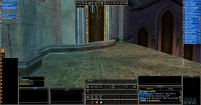
Some phone pictures with what I mentioned circled:


I know some of that is there for identifying what is what, but I know what my party window is. I know what my dialogue boxes are displaying. The extra cluttery chunky bits just take away from precious screen real estate.
Nothing would make me happier than something cleaner and more trimmed down than what Vert is. Just high quality clean boxes that stack and adjust along side each other nicely.
Vanilla EQ UI has those chunky bars along the top of each window, or those golden frilly bits around corners so if they get close to each other they clip through depending on which chat window is currently the focus.
Being able to remove the actual chat input on windows I never plan to ever chat in would also be fantastic. I only talk from one window. The rest is wasted space on each dialogue box.
Some phone pictures with what I mentioned circled:
I know some of that is there for identifying what is what, but I know what my party window is. I know what my dialogue boxes are displaying. The extra cluttery chunky bits just take away from precious screen real estate.
Last edited by a moderator:
@Sic, i'm using ur UI now... If there any updates could u post the UI again? following this threadi use a modified (by kaen and myself) version of Zliz
(this will need updates next week with the pet buff window =p)
Last edited:
@psymorph SparxxUI is still actively updated, best place to get the updates are the discord server: https://discord.gg/QEtepFn4Since someone brought up UI's, I was curious what you use Sic? I see some parts appear to be custom in your vids, but was not sure. I'll bet you made something yourself :P
I have been using Sparxx and it's the most decent I have found, but I'm getting concerned about the UI windows being updated when EQ makes changes as I am not sure the person maintaining it plans to continue to do so. As such, I may need to change.
TY. just saw that on their site and it looks like he posted the pet window update already!
I really like 95% of Sic's UI as well though. The only 2 things I like better in Sparxx is the group and spell cast windows. See below. Clean and I like the distance in the group window


I really like 95% of Sic's UI as well though. The only 2 things I like better in Sparxx is the group and spell cast windows. See below. Clean and I like the distance in the group window
Liquidtoots
Active member
- Joined
- Mar 9, 2022
- RedCents
- 466¢
Seanz,this is what Im using right now.. until recently its been bullet proof. If there is any interest I can upload it
That looks clean and simple! I love it! That would be great if you would be willing to upload that.
Thanks
i don't know what your question means@Sic should i use the march update folder? ... Couple things I add are Map, spell bar, changed the inventory... all good Thanks!
the zip i uploaded is my ui, which includes the updates i use including the pet window for today's live patch
In your posted 7zip file you actually had another 7zip file called zlizUpdateMarch9.7z
zlizUpdateMarch9.7z looks like is was in your UI/zliz folder already and was probably unintentionally included in this most recent 7zip. He was probably just confused when he saw it.
@mmoguy69 you can leave it or delete it, it's zipped and does not affect your UI
-Taz
zlizUpdateMarch9.7z looks like is was in your UI/zliz folder already and was probably unintentionally included in this most recent 7zip. He was probably just confused when he saw it.
@mmoguy69 you can leave it or delete it, it's zipped and does not affect your UI
-Taz
ah thanks for the clarification - i dunno how that happened - re attachedIn your posted 7zip file you actually had another 7zip file called zlizUpdateMarch9.7z
zlizUpdateMarch9.7z looks like is was in your UI/zliz folder already and was probably unintentionally included in this most recent 7zip. He was probably just confused when he saw it.
@mmoguy69 you can leave it or delete it, it's zipped and does not affect your UI
-Taz
a zip in the folder... sorry maybe dumb question? haha --> zlizUpdatesMarch9 --> which i'd paste and copy over ui pieces.. target window, buff window etci don't know what your question means
the zip i uploaded is my ui, which includes the updates i use including the pet window for today's live patch
doh, just read above... i'll just ignore it... ty
no don't use some out of date filea zip in the folder... sorry maybe dumb question? haha --> zlizUpdatesMarch9 --> which i'd paste and copy over ui pieces.. target window, buff window etc
Liquidtoots
Active member
- Joined
- Mar 9, 2022
- RedCents
- 466¢
Digging the UI Sic. TY!
yeah zliz did some good stuff (and then some updates from kaen and i to keep it rolling / our/my needs)Digging the UI Sic. TY!
No problem at all I hope you enjoy it.. if anything changes that breaks it Ill update it.Many thanks Seanz!
Loving this! thanks for the upload.No problem at all I hope you enjoy it.. if anything changes that breaks it Ill update it.
No problem. glad people are enjoying it.. Ive looked at the minamalist ui's and some go too far overboard.Loving this! thanks for the upload.
I just wanted the borders removed and a different buff and song bars than default.
Sic's in particular is a 7zip file which I think is still a third party (free) app you can download here
Once you have that and the file Sic posted, just go to your <EQHome>/uifiles directory, make a new folder called whatever you want like 'sicUIbro' and unzip the contents of Sic's file there. Then once you get in game you should be able to choose it (I think there's a dropdown now in the options menu?) via
Once you have that and the file Sic posted, just go to your <EQHome>/uifiles directory, make a new folder called whatever you want like 'sicUIbro' and unzip the contents of Sic's file there. Then once you get in game you should be able to choose it (I think there's a dropdown now in the options menu?) via
/loadskin sicUIbroOk, I know there is a post about this question I am going to ask somewhere because I'm fairly certain you shared it but I can not, for the life of me, find it. I use Sparxx and I consistently have to resize the group window when I log in with MQ so the "follow me", "come to me", "mimic me" are visible. I could have sworn someone else asked you about resizing this window in a different custom UI and you shared a fix. I also thought that post shared a fix for the sparxx UI as well. Do you recall where I can find the fix for this window? This way I can stop fixing 6 toons every day LOL.my current zliz
ty in advance!
this one? seems like the right thread at least, if not the right postOk, I know there is a post about this question I am going to ask somewhere because I'm fairly certain you shared it but I can not, for the life of me, find it. I use Sparxx and I consistently have to resize the group window when I log in with MQ so the "follow me", "come to me", "mimic me" are visible. I could have sworn someone else asked you about resizing this window in a different custom UI and you shared a fix. I also thought that post shared a fix for the sparxx UI as well. Do you recall where I can find the fix for this window? This way I can stop fixing 6 toons every day LOL.
ty in advance!
No, I found that one yesterday when looking and doing /groupinfo save did not do anything except bring up the commands available for /groupinfo, unless it saved it in the background with no notification. I have not logged in today yet to see =)
I just recall a post quite a while back that Sic responded to with the code to change the size in the file itself.
this one later in the thread perhaps?No, I found that one yesterday when looking and doing /groupinfo save did not do anything except bring up the commands available for /groupinfo, unless it saved it in the background with no notification. I have not logged in today yet to see =)
I just recall a post quite a while back that Sic responded to with the code to change the size in the file itself.
Psymorph, did you try Sic’s trick for CWTN plug-in windows to see if it worked with the group?
Namely, resize the group window including positioning; close the window entirely; reopen the window.
Just a thought. Might not have any effect but could be worth a try.
Be well. Happy gaming.
Namely, resize the group window including positioning; close the window entirely; reopen the window.
Just a thought. Might not have any effect but could be worth a try.
Be well. Happy gaming.
Nope, didn't try that but I will. Can't hurt...thx!Psymorph, did you try Sic’s trick for CWTN plug-in windows to see if it worked with the group?
Namely, resize the group window including positioning; close the window entirely; reopen the window.
Just a thought. Might not have any effect but could be worth a try.
Be well. Happy gaming.
Users who are viewing this thread
Total: 2 (members: 0, guests: 2)
Share: