• You've discovered RedGuides 📕 an EverQuest multi-boxing community 🛡️🧙🗡️. We want you to play several EQ characters at once, come join us and say hello! 👋
  • IS THIS SITE UGLY? Change the look. To dismiss this notice, click the X --->

Discussion - Creating new EQ1 UI - Opinions/Recomendations? (1 Viewer)

Joined
May 17, 2015
RedCents
5,824¢
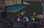
So I am starting to build a new UI that I will put on eqinterface soon.

Screenshot - Clean - Combat
Screenshot - Busy - inventory, map, advloot

Layout = Basically an L formation with 1-3px gaps between windows with a grayish/bluish/purplish background

Not shown in the graphic but I will be adding a bar at the bottom that will have like the EQ button, exp/aa bar, mercenary functions, radar and other things similar to graphite UI

The pet + combat abilities will be slimmed down as well as the group and player, I am hoping to fit the pet box under the player box and not have anything to the right of the spellbar.

**Couple questions that would be beneficial**

  1. Are 36 buttons (3 hotbars) sufficient on Live (lvl80+) to fit your: AA + Pet buttons + socials + items?
  2. Are 5 extended targets sufficient on Live (lvl80+) ?
  3. Do you like the layout?
 
I have 7 hotbars in use on TLP. I dont think level has as much to do with it, its more about how many toons you run and how much control you like to have over them. I'm always stuck with the default UI since so many don't keep them updated. .... I miss Krust....
 
I use between 5 and 7 hotbars myself, but that is mostly so I can legit box as well as having EQBC commands hotkeys for stuff.

Extended targets, depends. Unless I got my enchanter with me, anything over 3-4 is usually evac time. But my concern with limited ET window is when on raids. I tend to have MA1, MA1 target, and pet as the first 3 slots on my necro/mage toons. On healers I got the main tanks and back up tanks, plus other main healers...if I am back up healing ( IE shaman AE rain healing) I tend to have any straglers on XT who may not be in a group with a healer yet, ... ext ext. In other words... 5 is enough but I wouldn't lock it in place.

I like the lay out, but I prefer labels to buff icons/spell icons. But.. I am an info junkie =)

_______________________________

nyghteyes, I had the same problems till I got fed up enough to somewhat figure out XML code enough to edit single piece items enough to get what I want.. so I have ones that don't break every time they add new items (the main reason the UIs broke, the animation file got edited.. and a lot of the full blown custom jobs have special)

Now when something breaks, its just that 1 piece, and I can pull the default... re-edit the changes I want, and go on with my gimpy self.

Though I am kinda surprised there is not a RG UI with a window so folks can advertise while you play... "Live from RG it's AUTOCLERIC!" heh.
 
I will not be modifying the animations xml or the default graphic files, it gets way too complicated if you do that.
You can put your images, animations, title layouts and such within the chatwindow xml and that seems to work well.

Screenshot with qty=3 4x3 hotbuttons + qty=2 6x2 hotbuttons + example of the infobar

After I am comfortable with the layout I will go ahead and clean up the XML. Some pieces are already portable/contained but it is still messy.

Basically the concept is to keep the primary-always-viewable screenitems a size that takes the space of 1-3 4x3 hotbutton-bars or 1-2 6x2 hotbutton-bars.
This way people can reswizzle it to what they need. Like player/group/extended/target/tot/pet/combatabilities/bandolier/potionbar etc...

Planning for 1680x1050 as with my 34 ultrawide I can put two of them side by side with 12 characters on each for 24 characters


@ 1680x1050 you could put qty=8 4x3 hotbutton bars vertically on top of the bottom bar with the small pixel gaps
Plan for left 'column':
2 4x3 spots to player+group
3 4x3 spots to target + tot + extended target
1 4x3 spot for a hotbar

I like the lay out, but I prefer labels to buff icons/spell icons. But.. I am an info junkie =)

I am planning to steal some of the XML from Simple Stice Buffs will have a version with and without slot labels... or are you talking about having the full spell name listed out?
 
Buff window


Edit2.jpg

This is what I am using currently with a 21' wide screen monitor (so it is a little cramped with text bigger then really calls for... I'm old =P)

The target and group windows have MQ enhancements to include level, class, distance. And of course the HUD in the corner. Rest is legit. I usually have the chat windows smaller (3-4 lines of text each) so the right hand side looks more crowded there. But it was just to illustrate what I ment about the buff/spells.

The buff bars are min versions, adjustable... can shrink them enough the slot numbers do not show (done that to the song window in that screenshot) and show the amount of charges left on the buff on the left hand side. (buff timer on the right, can be adjust to not show them)

Bunch of the hotbuttons are various commands that I just got tired of repeating. Like assigning group roles, or changing to other set of toons on the same accounts (Team B) ect ect. But mostly is it so I can manually run the toon as needed. Hate offering to help someone with suchandsuch character and then I am not actually se tup to do something... cause the macro always handled it for me! heh. I figure I ought to know how to play the toon well... before setting them up to be macro'd.

PS the "not found" buttons are from copying a different toon's set up to use on this toon (who has low AA)
 
Last edited:
I like the simplicity. The biggest thing, honestly, that I hate about the default to though, is the map. I used to use a map mod that let you change the map texture on the fly to either dark or light, because there is no standard color scheme for all the stupid lines in zones. Sadly, it's very outdated.

Btw, you missed the name on the advl window.
 
How about this layout with 6 hot bars?
Image 1
Image 2

Still need to rebuild
-petwindow
-all gauges (I dont like the default ones look)
-collapse target + ToT
-player window
-group window
-combat abilities window
-info bar
-map window
-DB/EQ button (will go into info bar)
-all the misc windows window title bars (like quest/tasks/altadv/dialogs etc...)
 
I Love it. It addresses all the thngs I like in a UI from what I saw. I'd use from now on. When can I get it.
 
looking good. I use Sparxxx UI currently. I think many of the windows could be smaller and more easily customized. why do many of the UI windows have to cover half or 3/4 of the screen all windows need to look clean but economised. I also use 10 hotbars to run my necro and could even use more I dont like to roll them over to other pages. I dont think 5 extended targets are enough but I think the window should start small and then grow as more mobs are pulled. best luck working on this and have a happy holiday.
 
Yea I increased ext-targets to 7 and can probably get it to 10 when I merge ToT+Target
6 hot bars, may be able to fit 7 if I shrink them but I like the big buttons.... if you use a higher resolution that 1680x1050 I am sure you could fit more.
 
If you check out EQInterface there is a hotbutton mod that makes the buttons wider. What this means is, you can shrink the button bar down ( change the button size using the drop down menu, I personally go for 65ish) and still be able to ready most of the button's text. So you end up with a shorter, but wider hotbar, and instead of just seeing " ATT" you get "ATTACK!"

- - - Updated - - -

I initially got that for my necro, heh. There are a lot of things going on with necros =P

Just thought someone might findit useful.

Awesome work there LH. I know wrestling with XML code to be a headache =X
 
Discussion - Creating new EQ1 UI - Opinions/Recomendations?

Users who are viewing this thread

Back
Top